


Two buttons sit side by side on the homepage, same size, same color. One says Start free trial. The other says Book a demo. An operations lead at a 40-person company reads the headline twice, scrolls for a price, finds "Contact us," and leaves. A solo developer clicks Book a demo because it was on the left, and gets a form asking for company size.
Both were good fits. The site was built for neither of them.
Website design for SaaS starts with one decision that comes before any design file: does your site sell the product itself (product-led) or sell a conversation with your team (sales-led)? The homepage, the pricing page, the forms and the numbers you track all follow from that answer. Below, the two site models go head to head, page by page, so you can see which one your product needs and where a hybrid works or quietly breaks.
Product-led vs sales-led sites at a glance
A product-led site moves visitors into the product. A sales-led site moves them toward a person. Almost every page decision on a SaaS site follows from which of those you are.
Here is how the two models differ across the parts of the site that matter most.
| Product-led site | Sales-led site | |
|---|---|---|
| Main button | Start free, Sign up | Book a demo, Talk to sales |
| Hero | The product interface, working | The business outcome, backed by peers |
| Pricing page | Public plans with self-checkout | Ranges or "contact us," built around what drives price |
| Form | Email or single sign-on, nothing else | Qualifying fields that route to the right rep |
| Proof | Usage numbers, reviews, templates | Case studies by industry, logos, security documents |
| Navigation | Product, Pricing, Docs, Log in | Solutions by role or industry, Customers, Resources |
| Content that sells | Tutorials, templates, integrations | Comparison pages, case studies, ROI material |
| Number to watch | Signup to activated user | Demo request to qualified opportunity |
| Typical buyer | One person with a company card | A group with a procurement step |
Neither column is the better one. A $15-a-month scheduling tool with a demo-only site loses most of its buyers at the form. A six-figure platform with a "Start free" button collects signups from students and calls it pipeline.
Which model fits your product?
Price, buyer and setup time decide it. Cheap, single-user products that show value in one session lean product-led. Expensive, multi-stakeholder products that need integration work lean sales-led.
Three questions settle it for most teams:
- Can someone get real value in their first session without help? If setup needs a data import, an admin, or a call with your team, a signup button leads to an empty dashboard.
- Can one person pay without asking anyone? If the price fits on a company card, let them. If it needs a budget line, they will be building a case for colleagues, and your site has to help with that.
- Does the deal need a security review or procurement? Then the site has to serve readers who will never sign up at all: IT, finance, legal.
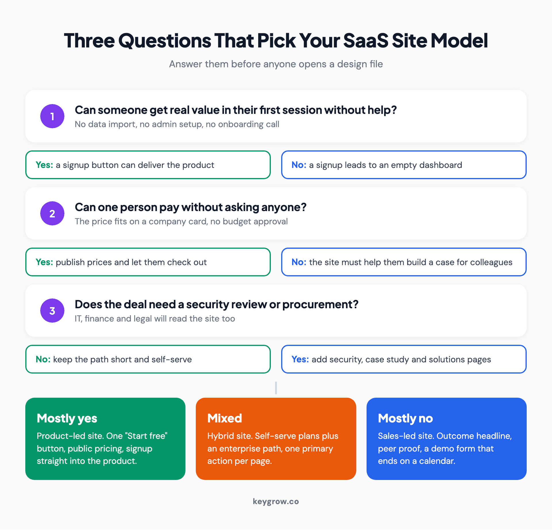
Decision flow with three yes-or-no questions about first-session value, single-person purchase and security review, leading to a product-led, sales-led or hybrid SaaS website model.
Self-serve is the more common front door. In a study of 200 B2B software products, ChartMogul's 2026 report found 57 percent use a free trial as the main entry point for new customers and 26 percent use freemium. Among products that are mostly SaaS, the free trial share was 61 percent. So if you are unsure, the burden of proof sits with the demo-only site, not the other way round.
Homepage: show the product, or state the outcome
Product-led homepages put the working interface on screen and ask for a signup. Sales-led homepages name the business result, prove it with companies like the visitor's, and ask for a meeting.
You do not get long to make the case. Nielsen Norman Group research found people often leave a page within 10 to 20 seconds, while pages with a clear value proposition hold attention far longer. The hero is where that proposition lives.
On a product-led homepage, the hero carries:
- A headline that names the job ("Schedule your whole team in one view"), not the category.
- A real screenshot or short loop of the product doing that job.
- One button. If no card is needed, say so under it.
On a sales-led homepage, the hero carries:
- A headline that names an outcome for a specific buyer, such as finance teams closing the books faster.
- Logos or a one-line result from companies the visitor will recognize as peers.
- A demo button, plus a quieter link to a product tour for people not ready to talk.
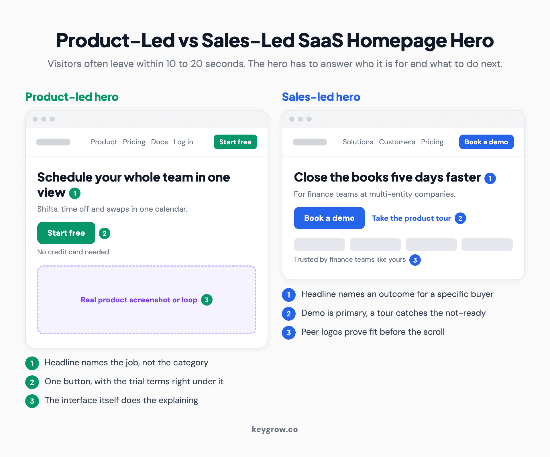
Two annotated homepage hero wireframes side by side: a product-led hero with a product screenshot and one Start free button, and a sales-led hero with an outcome headline, peer logos and a Book a demo button.
The cold open above is what happens when a team cannot pick. Two equal buttons look balanced in a design review. To a visitor, they read as a question the company should have answered for them.
Pricing page: public plans vs "talk to us"
Self-serve products should publish prices and let people check out on the spot. Sales-led products can hold back the final number, but they should still show what drives it.
For product-led sites, the pricing page is where a trial gets set up, so its design choices change your numbers. The same ChartMogul study found the 14-day trial is the most common length (62 percent of products), and that 20 percent of free trial products ask for a credit card upfront. Those card-required trials converted 30 percent of signups to paid, more than five times the rate of trials without a card. The median free-to-paid rate across all products was 8 percent.
Treat it as a design decision as much as a billing one. Asking for a card shrinks the signup count and raises the share that pays. Whichever you choose, the page should say it plainly next to the button, because surprises at checkout end trials.
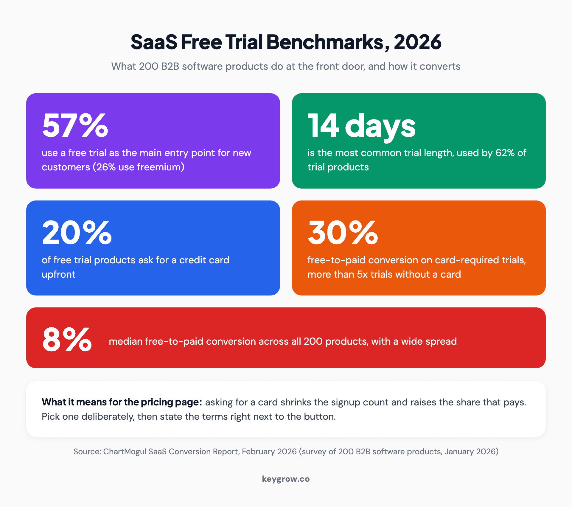
Stat block of 2026 SaaS free trial benchmarks: 57 percent of products lead with a free trial, 14 days is the most common trial length, 20 percent require a card, card-required trials convert 30 percent to paid, and the median free-to-paid rate is 8 percent.
For sales-led sites, a bare "Contact sales" button is the weakest version of the page. The person researching is often building a shortlist for someone else. Give them something to take back: what pricing depends on (seats, usage, modules), what each package includes, a starting point if you can stand to publish one, and answers to the procurement questions they will be asked.
Most growing SaaS companies land on the hybrid layout: two or three self-serve plans with public prices, then an enterprise column that leads to a conversation. It works because each column has one job.
Signup flow vs demo form
A self-serve signup should take seconds. A demo form can ask more, because each answer routes the lead, but every extra field has to earn its place.
Product-led signups work best with an email field or single sign-on and nothing else, then straight into the product. Ask about role and team size inside the onboarding, where the answer changes what the user sees next. Asking before they have seen anything just adds a step.
Sales-led forms are a different trade. Name, work email, company and company size let you send a 10-person team to one rep and a 2,000-person company to another. Past four or five fields, each new question needs a reason someone on your team can name. The bigger leak is usually after the form: a thank-you page that says "we'll be in touch" instead of showing a calendar while the buyer is still at their desk.
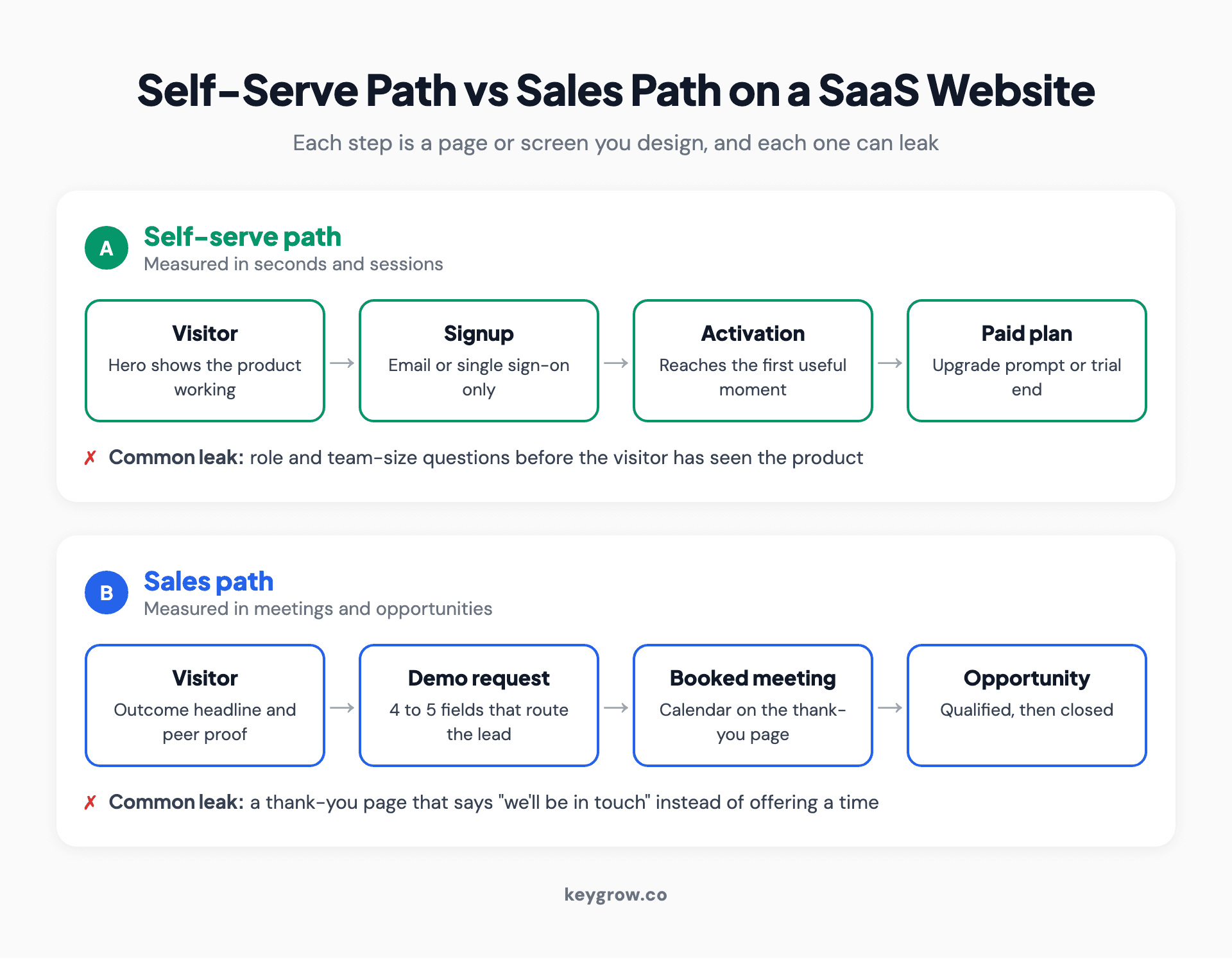
Two-lane flow diagram comparing the self-serve path from visitor to signup, activation and paid plan with the sales path from visitor to demo request, booked meeting, qualified opportunity and closed deal.
If paid search feeds either path, the form is where lead quality gets decided. We go through the two-field version of a trial form in our guide to Google Ads for SaaS.
The pages both models need
Feature, integration, comparison, security and blog pages earn their place on either kind of SaaS site. What changes is the order you build them in.

A designer sketching website wireframes on a tablet with a stylus.
A product-led team should build in roughly this order: homepage, pricing, signup and onboarding, help docs, integration pages, then templates or use-case pages. A sales-led team should start with the homepage, solutions pages by role or industry, case studies, the demo page, a security and trust page, then comparison pages.
Integration pages and honest comparison pages are worth singling out. They answer questions nobody else can answer about your product, which is why they still pull search traffic when generic explainers get summarized away, as we argue in our piece on SEO for SaaS. A security page that lists your certifications, data handling and subprocessors spares your sales team from answering the same questions by email on every enterprise deal.
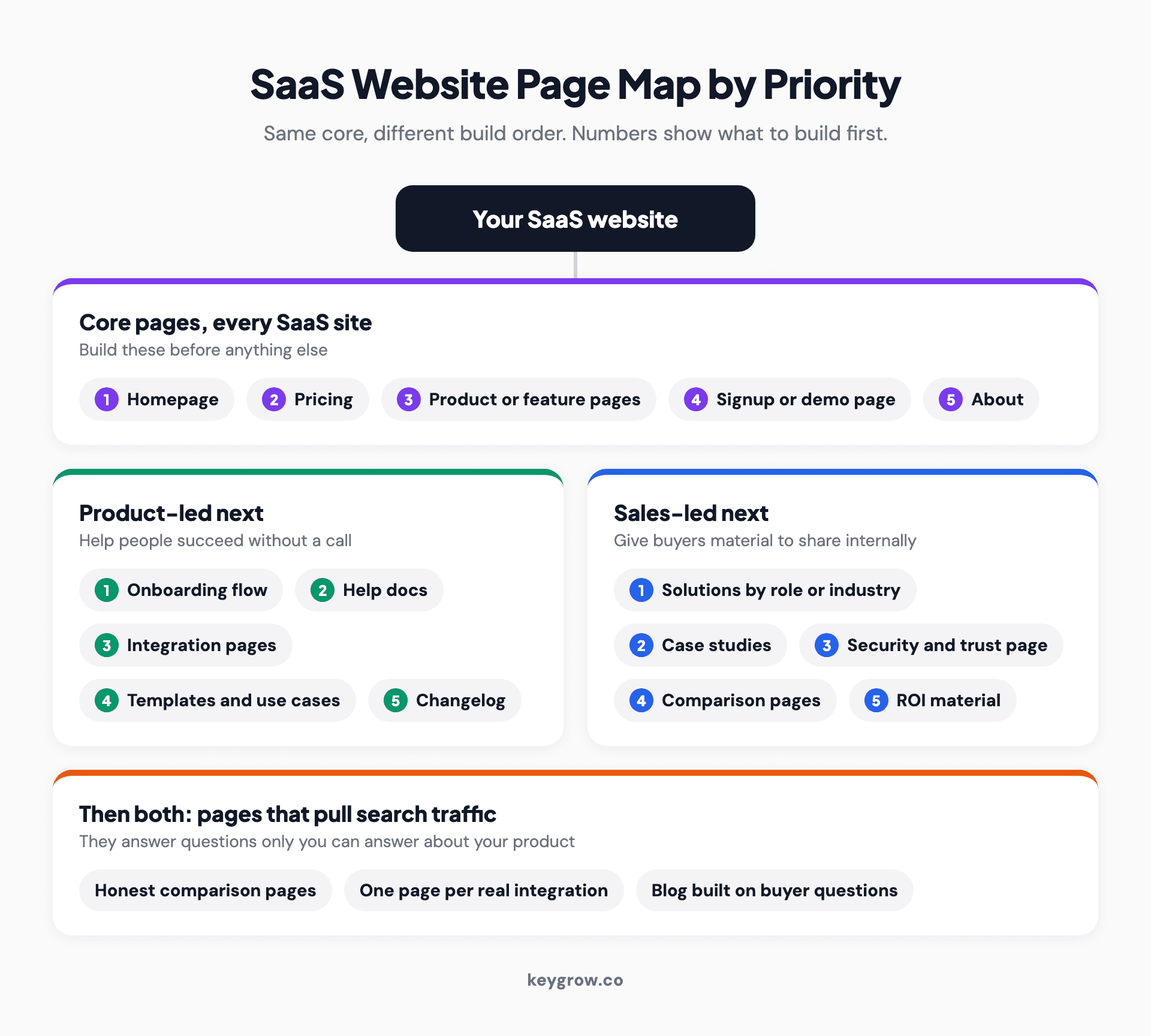
Page map of a SaaS website grouped by priority: core pages every site needs, product-led pages such as docs and templates, and sales-led pages such as solutions, case studies and a security page.
The hybrid trap
Most SaaS companies end up selling both ways. The fix is one primary action per page, with a clear handoff to the other path.
Hybrid is normal, even among self-serve products. ChartMogul's study found 80 percent of free trial products bring in a human when an enterprise user starts a trial. The site version of that is page-level intent:
- Product and feature pages: signup is primary, and "talk to sales" is a text link.
- Solutions and industry pages: demo is primary, because those visitors came looking for fit.
- Pricing page: self-serve plans check out, and the enterprise column books a call.
- Navigation: one button, with the other path as a plain link beside it.

A software team working at desks with monitors in an open office.
The same rule applies to paid traffic. Sending ad clicks to a homepage that serves both motions is the most expensive default in paid search. A detailing client of ours was paying around $100 per booking with clicks landing on the homepage. A dedicated page took that to $22 between August and December 2022. Software is no different: someone who searched "[category] pricing" should land on pricing, and someone who searched for an integration should land on that integration page. Paid search is also the fastest way to learn which terms produce demo requests at all, which is the loop behind how we combine SEO and PPC for SaaS.
Webflow, WordPress or a coded build?
Pick the platform your marketing team can edit without opening a ticket. For most SaaS marketing sites that matters more than which tool wins a feature checklist.
| Webflow | WordPress | Coded (for example Next.js) | |
|---|---|---|---|
| Who edits day to day | Marketers, visually | Marketers, through a CMS | Developers, unless a headless CMS is added |
| Strong at | Design control, fast landing pages | Large blogs, plugins, many editors | Sharing code and design with the product app |
| Watch for | Plan costs as the site grows | Plugin sprawl and speed | Every copy change waiting on engineering |
We build on all three, and the honest answer is that the platform is rarely what holds a SaaS site back. Unclear messaging and a pricing page nobody owns are. Our own projects usually take 6 to 8 weeks from discovery to launch, 4 to 5 weeks for a simple site, and 10 to 12 weeks when a web app is part of the scope. Cost moves with page count, custom illustration and animation, and how much the site has to talk to your product and CRM. Our web development service page covers what a build includes.
When you don't need a designer yet
Before you have a repeatable way of selling, a template and a sharp headline will do. Pay for design once you know who buys and why.
Pre-launch and early-stage teams are better off with one page, a clear sentence about who the product is for, and a signup or waitlist. Spend the money talking to users. A custom site built before you know your buyer gets rebuilt the moment you find out.
It is time to invest when one of these is true:
- You are about to spend real money on paid acquisition.
- You are hiring your first salespeople and they need pages to send.
- You have added a second segment or product and the site cannot explain both.
- You can name the page where visitors drop off, and a copy tweak has not fixed it.
Track the number your model lives on
Judge a product-led site on signup and activation, and a sales-led site on qualified meetings. Traffic and time on page tell you neither.
For product-led sites, watch three rates: visitor to signup, signup to activated user (someone who reached the moment your product is useful), and trial to paid. For sales-led sites, watch visitor to demo request, request to held meeting, and meeting to qualified opportunity. Both kinds need the original source passed into your CRM at signup, so a page redesign can be judged on revenue rather than on a signup count that may hide worse leads.
FAQs
What pages does a SaaS website need?
At minimum, a homepage, a pricing page, feature or product pages, a signup or demo page, and an about or company page. Product-led sites add help docs, integrations and templates early. Sales-led sites add solutions pages by role or industry, case studies and a security page. Comparison pages and a blog help both once the core is in place.
Should a SaaS website show pricing?
If customers can buy without talking to anyone, yes, publish it with a checkout. If every deal is custom, you can hold back the exact number, but show what drives the price and what each package includes. A bare "contact sales" page loses the researcher who is building a shortlist for their boss.
Should a SaaS homepage have both a free trial and a demo button?
Only if one is clearly primary. Two equal buttons push the decision onto the visitor. Make the main button match your main buyer, and offer the other path as a smaller text link or on the pages where that buyer arrives.
How long does a SaaS website redesign take?
Our projects usually run 6 to 8 weeks from discovery to launch, about 4 to 5 weeks for a simple site, and 10 to 12 weeks when a web app is in scope. Copy and approvals are the most common source of delay, not design or development.
Is Webflow or WordPress better for a SaaS website?
Both work. Webflow suits teams who want visual control and fast landing pages; WordPress suits content-heavy sites with many editors. Pick the one your marketing team can update without a developer, because a site nobody can edit goes stale.
How is a SaaS website different from a regular business website?
A SaaS site has to sell something the visitor cannot touch, often to a buyer who will use it every day. That means showing the product working, publishing or explaining pricing, and handing visitors into a trial or a sales conversation. A regular business site usually ends at a phone call or a contact form.
Where to start this quarter
You do not need a full rebuild to fix the biggest problems. In order:
- Pick your primary motion. Answer the three questions above and write the answer down, so design reviews stop reopening it.
- Give every page one main action. Start with the homepage and pricing page, since that is where two-button indecision costs most.
- Fix what happens after the button. Signup straight into the product, or a demo form that ends on a calendar.
- Wire the source into your CRM. Then judge the next redesign on qualified signups or meetings, not traffic.
If you want a second pair of eyes on which model your site should run, our team works with SaaS companies on exactly this: structure first, then the build.