


A visitor lands on your homepage from Google Maps on a phone. You have about one screen to tell them three things: what you do, that you do it where they live, and how to reach you. The rest of the page is there to back those up.
That is most of what homepage design best practices come down to for a service business. A good homepage is a sequence: a first screen with a headline, one line of proof and one call to action, then services, proof, process, common questions, and a footer with your name, address and phone number. Get the order right and the styling matters far less.

Two people tapping a map on a smartphone screen while looking for a place nearby.
Below is that sequence as one wireframe, then nine practices in the order a visitor scrolls, each with the research behind it and a 30-second self-test. The example is a made-up kitchen and bath remodeler. Swap in your trade.
This post covers layout and order. If the words are the weak spot, our website copywriting guide rewrites a first screen line by line, and if you are deciding where paid clicks should land, read landing page vs homepage first.
The whole homepage on one wireframe
A service business homepage works best as seven stacked blocks: header, first screen, services, proof, process, questions and footer. Each block has one job, and the order follows the doubts a stranger has.
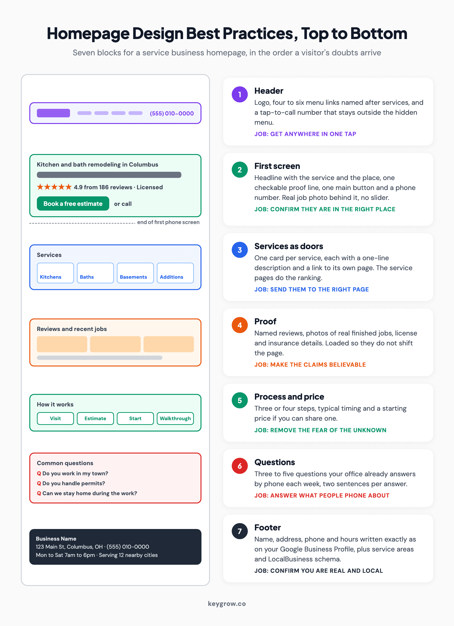
Annotated homepage wireframe for a service business showing seven blocks from top to bottom: header with logo, short menu and tap-to-call number; first screen with a service-and-city headline, a review line and one button; service cards that each link to their own page; reviews and job photos; a four-step process; three to five common questions; and a footer with name, address, phone, hours and service areas.
| Block | Its one job | What goes in it |
|---|---|---|
| Header | Get them anywhere in one tap | Logo, four to six menu links, tap-to-call number |
| First screen | Confirm they are in the right place | Service and area headline, proof line, one button |
| Services | Send them to the right page | One card per service, each linking to its own page |
| Proof | Make the claims believable | Reviews, photos of real jobs, license details |
| Process | Remove the fear of the unknown | Three or four steps, timing, a price starting point |
| Questions | Answer what people phone about | Three to five short questions and answers |
| Footer | Confirm you are real and local | Name, address, phone, hours, service areas |
Someone who has not yet confirmed you do kitchens will not read your process. Someone who has not seen a single review will not book a consultation because the button is orange.
1. Say what you do and where, in the headline
Your headline should name the service and the place, as in "Kitchen and bath remodeling in Columbus." The first thing every visitor wants to know is whether they are in the right place.
It is also the most-read line on the page. In Nielsen Norman Group's eyetracking research, published in 2018, people spent about 57 percent of their viewing time above the fold and 74 percent within the first two screenfuls. Jakob Nielsen was asking for a one-sentence tagline that says what the company does back in his 2002 homepage guidelines. The advice has aged better than most websites from 2002.
A brand line like "Building dreams since 1998" can sit under the headline. It should not replace it.
Not a local business? Swap "where" for "for whom." "Bookkeeping for restaurants" does the same work.
30-second test: open your homepage on your phone and cover the logo with your thumb. Could a stranger name your service and your area from the headline alone?
2. Put proof beside the headline
Put one line of proof directly under the headline: a star rating and review count, years in business, or a license number. A claim gets believed when something checkable sits next to it.
Plenty of homepages we see park the reviews in a slider two-thirds of the way down. By then the phone visitor has decided. A line such as "4.9 from 186 Google reviews, licensed and insured" (placeholder numbers) costs one row of space and answers the second thing every stranger wonders, which is whether you are real.
The hero photo counts as proof too. Nielsen's 2002 guidelines favor real people connected to the topic over models, and a remodeler's own finished kitchen will outwork any stock couple holding paint swatches.
Thin on reviews? Use anything a stranger could check in ten seconds, like a license number or a neighborhood you have worked in, and start on our guide to getting more Google reviews.
30-second test: without scrolling, can you see one fact about the business that a stranger could check?
3. Give the first screen one button and a phone number
The first screen needs one main action, named for what happens next ("Book a free estimate"), plus a phone number people can tap. Two buttons of equal weight split the decision.
Pick the action your best customers already take: a consultation request for a remodeler, a call for an emergency plumber. Make that button the most visible thing on the screen, with the phone number beside it.
On a phone, size is literal. The WCAG 2.2 accessibility standard sets a minimum tap target of 24 by 24 CSS pixels, and real thumbs do better with more room. A number typed as plain text without a call link, or baked into an image, cannot be tapped at all.
Repeat the same button further down if you like.
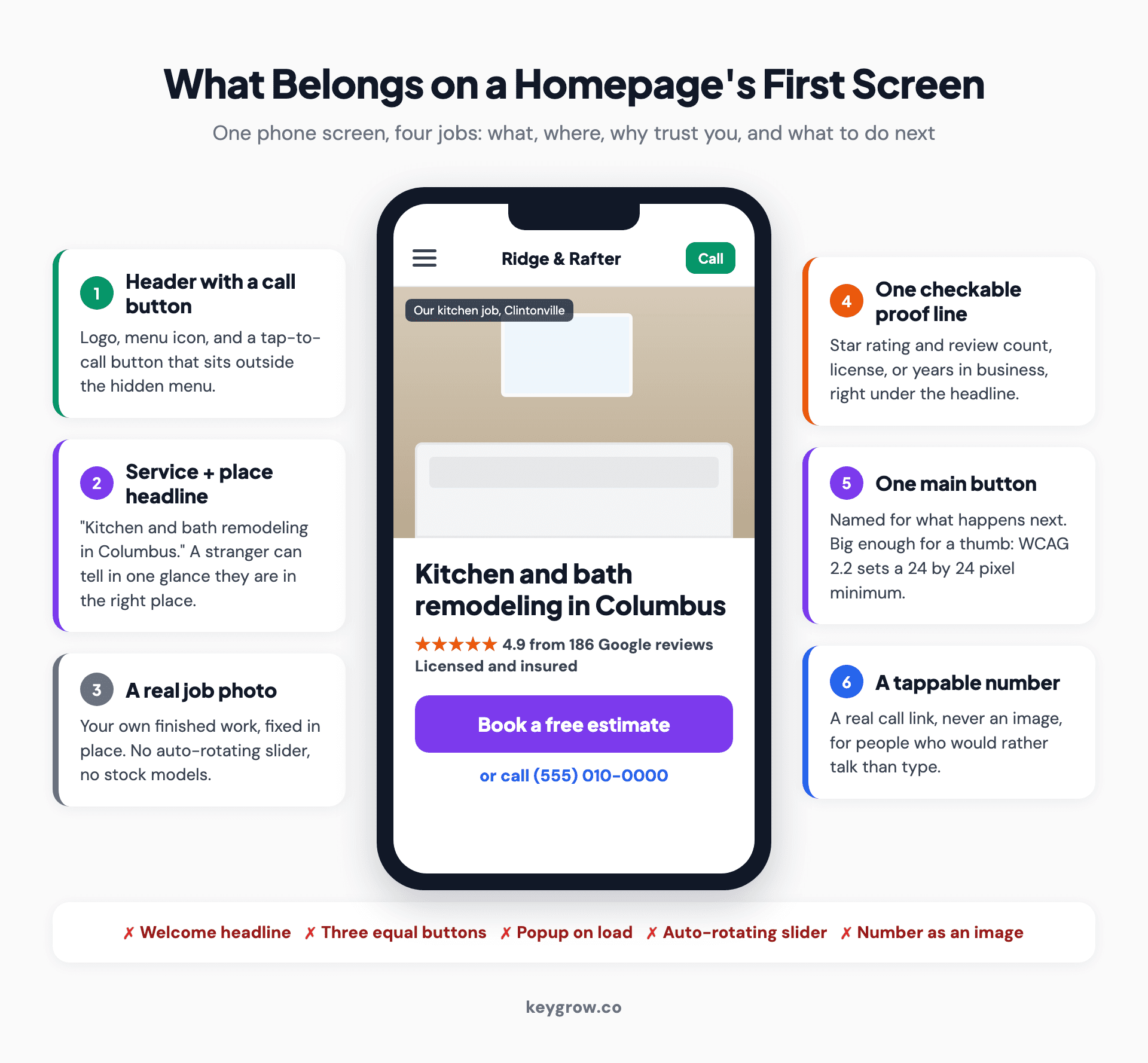
Annotated phone mockup of a homepage first screen for a kitchen and bath remodeler, labelling six elements: a header with a tap-to-call button, a headline with the service and city, a real job photo instead of a slider, one proof line with the review count and license, one primary button reading Book a free estimate, and a tappable phone number, plus five things to avoid such as a welcome headline and a popup on load.
30-second test: on your phone, can you start a call or a booking from the first screen with one tap?
4. Keep the menu short, and visible where you can
Use four to six menu items named after what people came for, such as services, reviews, areas and contact. On desktop, show them instead of hiding them behind a menu icon.
A Nielsen Norman Group study with 179 participants found that hiding the main navigation hurt the experience on desktop and on mobile, though less on mobile. The mobile sites that did best kept at least part of their navigation in view.
On a phone the menu icon is often the only practical option, and that is fine as long as the phone number and the main button sit in the header itself, outside the hidden menu. Label links by where they lead. "Kitchen remodeling" beats "What we do," and "Our story" can move to the footer without anyone missing it.
30-second test: read your menu aloud. Does every item name something a customer would look for, and are there six or fewer?
5. Turn services into doors
Show one card per service, each with a one-line description and a link to its own page. The homepage points the way. The service pages do the selling and the ranking.
Nielsen's guidelines ask for clear starting points for the main one to four tasks people come to do. On a remodeler's homepage those are kitchens, bathrooms, basements and additions, not a paragraph headed "Services" that lists eleven things in one breath.

A contractor cutting trim on a miter saw inside a home being remodeled, with a second worker behind him.
It matters for search as well. A homepage is a poor fit for ranking six different services at once, while six focused pages each get a fair shot. When we rebuilt the site for a junk removal company in Missouri, the old one had a cluttered layout, unclear calls to action and no dedicated service pages. The new homepage pointed into a separate page for each service. Lead form submissions rose 180 percent in 8 weeks, and pages per session went from 1.2 to 3.8. Our junk removal website redesign case study has the before and after.
30-second test: tap each service on your homepage. Does every one open its own page?
6. Show how the job works, and roughly what it costs
Add a three or four step "how it works" block and, if you can, a starting price or typical range. Uncertainty about process and cost is what stops people booking.
By this point your photos have settled the quality question. What is left is the unknowns. Will someone come to the house? How long will we be without a kitchen? Will the price jump halfway through?
Four steps usually cover it: a consultation at the home, a written estimate within a set number of days, a start date, and a final walkthrough. Add a starting point if you can ("most bathroom remodels start at $[X]"). A visitor who sees a range and still clicks has already accepted the ballpark, which saves you a wasted trip to measure.
30-second test: could a visitor describe what happens after they press your button?
7. Answer the questions people phone about
Close the main content with three to five short questions and answers, the ones your office already answers by phone every week.
Ask whoever picks up the phone. Do you work in my town? Do you handle permits? Can we stay in the house during the work? Two sentences per answer is plenty.
The block does a second job for search and AI answers. Roughly 44 percent of ChatGPT's citations come from the first third of a page, which is why we treat answer-first structure as non-negotiable on every page we build, homepage included. Short questions with plain answers give those systems facts they can quote instead of a slogan they have to interpret.
30-second test: write down the three questions your phone gets most. Is each one answered on your homepage?
8. End with a footer that matches your Google profile
The footer should carry your business name, address, phone number and hours, written exactly as they appear on your Google Business Profile, plus the areas you serve.
That match, usually called NAP consistency, helps Google tie your site to your map listing, which is where our phone visitor came from. Write the address as text, never as an image, then add LocalBusiness structured data so search engines can read the details without guessing. Our guide to local business schema markup has code you can copy.
Keeping your street address private? List cities instead, as long as site and profile agree.
30-second test: put your footer next to your Google Business Profile. Does every character match, down to "St." versus "Street"?
9. Make the first screen fast and keep it still
Your first screen should appear within 2.5 seconds on a phone, stay put while it loads, and never open with a popup or an auto-rotating slider.
Google's Core Web Vitals set the bar: the largest element visible within 2.5 seconds, a response to a tap within 200 milliseconds, and layout shift at 0.1 or below, all measured at the 75th percentile of visits. Google indexes and ranks the mobile version of a site, so the phone version is the one that counts. On the sites we build, the target is under 2 seconds and 90 or more on Google PageSpeed Insights.
The usual culprits are a hero video, an uncompressed photo, and a review widget that loads last and shoves the button down just as someone goes to tap it. Google's guidance on intrusive interstitials says not to cover the whole page and suggests a small banner instead. Sliders have their own record: in a 2013 Nielsen Norman Group test, a user failed to find a discount that was the biggest thing on a homepage, set in 98-point type, because the panel rotated away before she read it.
30-second test: run your homepage through PageSpeed Insights on mobile. Is Largest Contentful Paint under 2.5 seconds, and does anything cover the page in the first few seconds?
Mistakes we see on homepages we rebuild
Most of these take an hour to fix.
- A slider as the first screen. Three rotating messages, and the visitor reads one at best.
- Three buttons of equal weight. "Get a quote", "Learn more" and "About us" in a row turns the first screen into a quiz.
- A phone number that cannot be tapped, because it is an image or only appears in the footer.
- Services as one paragraph. Eleven trades in a sentence, none of them linked.
- Reviews at the very bottom, often inside a widget that loads last and moves everything above it.
- A footer address that does not match the Google profile. The business moved, one listing got updated, and nobody remembered the other.
- Stock handshakes. Nobody has ever booked a remodel because two models in suits agreed on something.
Do you need a new homepage, or a reshuffle?
Usually a reshuffle. If the site runs on a decent platform, loads reasonably fast and already has a page for each service, you can apply most of this list yourself in an afternoon: rewrite the headline, move the reviews up, delete the slider, fix the footer.
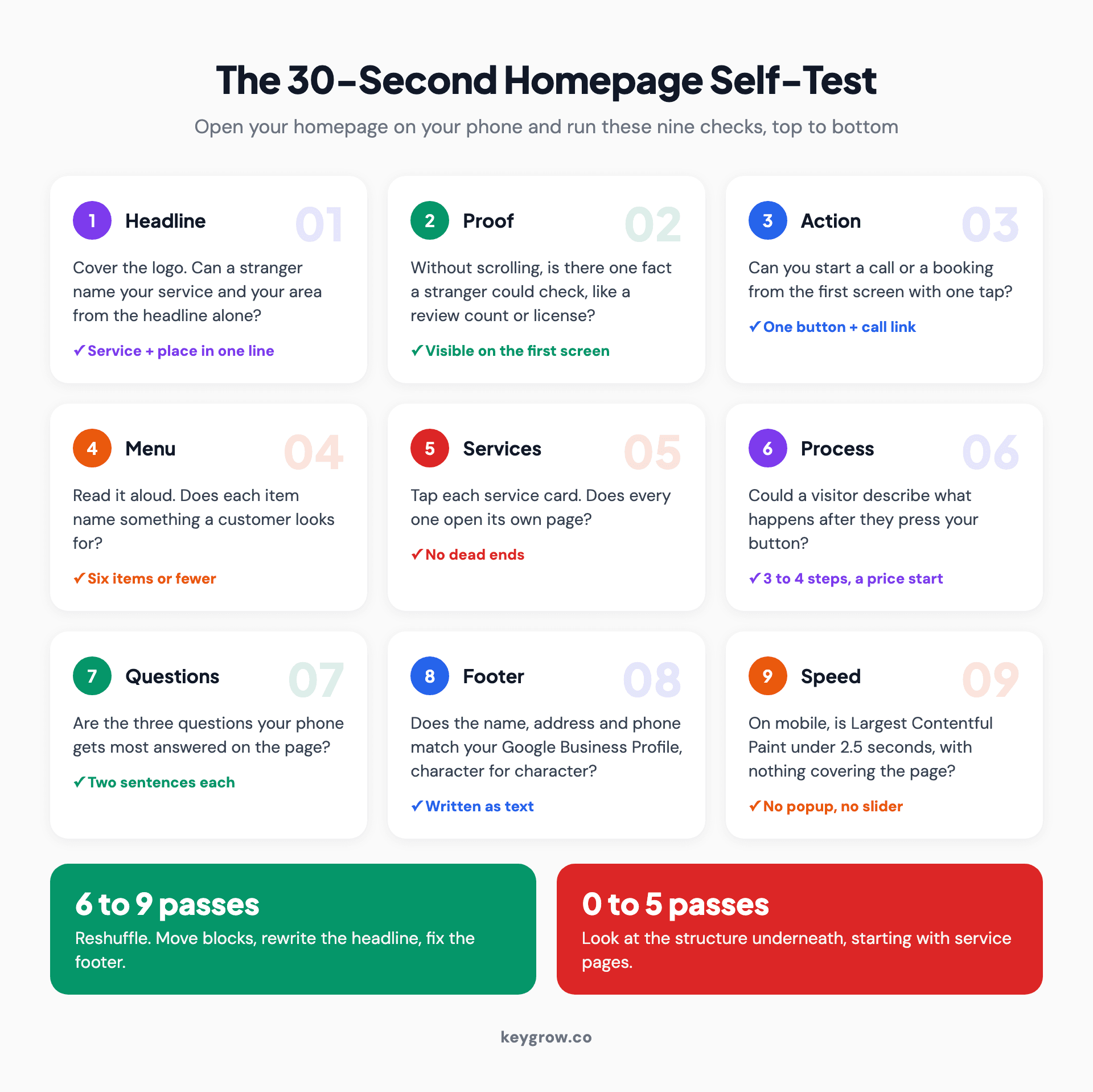
Checklist grid of nine 30-second homepage self-tests: headline names service and area, a checkable proof line on the first screen, one-tap call or booking, six or fewer menu items, every service card opens its own page, a visitor can describe the process, the top three phone questions are answered, the footer matches the Google Business Profile, and mobile Largest Contentful Paint is under 2.5 seconds with nothing covering the page.
Score your page on the nine tests. Pass six or more and a few edits will get you there. Fail most of them, or find there are no service pages to link to, and the problem is the structure underneath, which moving blocks around will not fix. Before you replace a site that already ranks for something, read how to redesign a website without losing SEO.
If you would rather hand the whole job over, our small business website design plans start at $1,400 for a site of up to six pages, copywriting included. If the urgent problem is paid clicks landing on the homepage, our landing page design work builds a separate page for each campaign, so the homepage can go back to serving everyone else.
FAQs
What should be on a homepage?
A service business homepage needs a headline naming your service and area, one line of proof, one main call to action and a tappable phone number on the first screen. Below that, in this order, come service cards linking to their own pages, reviews and job photos, a short process, a few common questions, and a footer with your name, address, phone number and hours.
How long should a homepage be?
Long enough to cover seven blocks (header, first screen, services, proof, process, questions, footer), which for most local service businesses is five to eight phone screens. Order matters more than length, because most attention goes to the first two screens.
Should a homepage have a slider?
Usually not. An auto-rotating slider hides most of its messages, pushes the main action out of view and often slows the page. One fixed headline over one real photo of your work does the job better.
How many calls to action should a homepage have?
One primary action, repeated down the page, plus a phone number. Secondary links such as "See our work" are fine as plain text links, but they should not look like a second main button on the first screen.
Does homepage design affect SEO?
Yes, in a few concrete ways. Google ranks the mobile version of the page, Core Web Vitals feed its page experience signals, and links from the homepage help each service page get found and ranked. The homepage itself usually ranks for your brand name and broad terms rather than for each service.
Audit it on your own phone
Pull up your homepage on your phone, from a Maps search if you can, and run the nine tests from the top. Fix the first screen before anything else, because it is the only part every visitor sees. If the list turns up more than an afternoon of work, tell us about your site and we will say plainly whether it needs a rebuild or a reshuffle.